


You might have found that there was some agreement and some disagreement.The accuracy
of the maps depends mostly on what you mean by ‘accurate’ and this depends largely on what
sort of information you want to know. If you are wondering where countries are in relation to
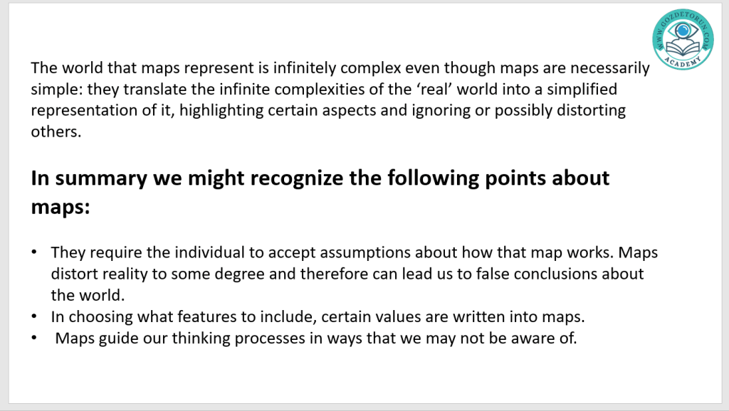
one another, then Maps 3, 4 and 5 will do that j ob well. If, however, you are wondering what
geographical features you might expect to find in certain places (mountains, deserts, oceans,
j ungles) then perhaps Maps 1, 2 and 6 would be more useful. All the maps could tell you what
was directly north or south or east or west of some point, but some present their information
in a way that makes this more easy than others: Map 6 uses these directions but it makes this
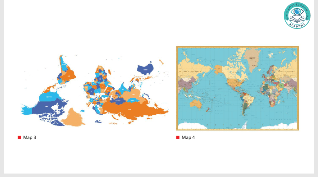
information hard to read. Map 3 has exactly the same information as maps we’re used to seeing, but it simply places south at the top as opposed to the normal convention of placing south at the bottom.
In order to read or follow any map, we must be aware of how the map works and what
conventions and assumptions are written into the creation of the map. The cartographer (map maker) would have made a decision about how to lay out the map and this required them to decide both how to represent the world and what to represent. Maps 1, 2 and 6 ignore the human and political features of the world (cities and countries) and instead opt only to tell the reader what the world looks like. Maps 3, 4 and 5 decide to show only the human and political features. Each map also makes a decision to orientate itself in a certain direction. This decision is most obvious in Map 3, given that it offers an orientation (the south is at the top) which we normally don’t see.
This decision, however, doesn’t mean that the map is any less accurate in its depiction of the
facts; it’s simply that we don’t normally see south at the top. The point is that we cannot read a
map effectively – we cannot see how it tells us anything about reality – unless we understand
and accept these conventions.
Much of this understanding and acceptance happens non-consciously – when we see maps
with north at the top, we don’t even think about it. When we see maps with south at the top,
we can quickly change our understanding and get on with the task of reading it in the same
way as other maps we’re more used to. What we often don’t think carefully about, however,
is what these conventions and assumptions written into the maps lead us to think. Consider
the differences between Maps 1 and 2: the physical shapes of the continents are very different,
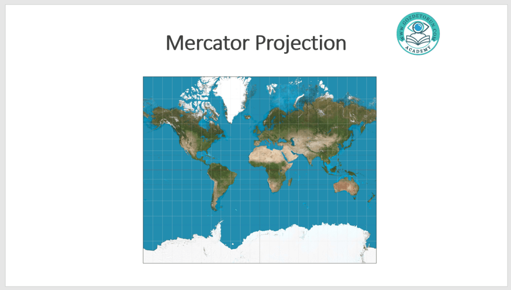
particularly as you look at the land masses furthest from the equator. Consider Map 1. This is
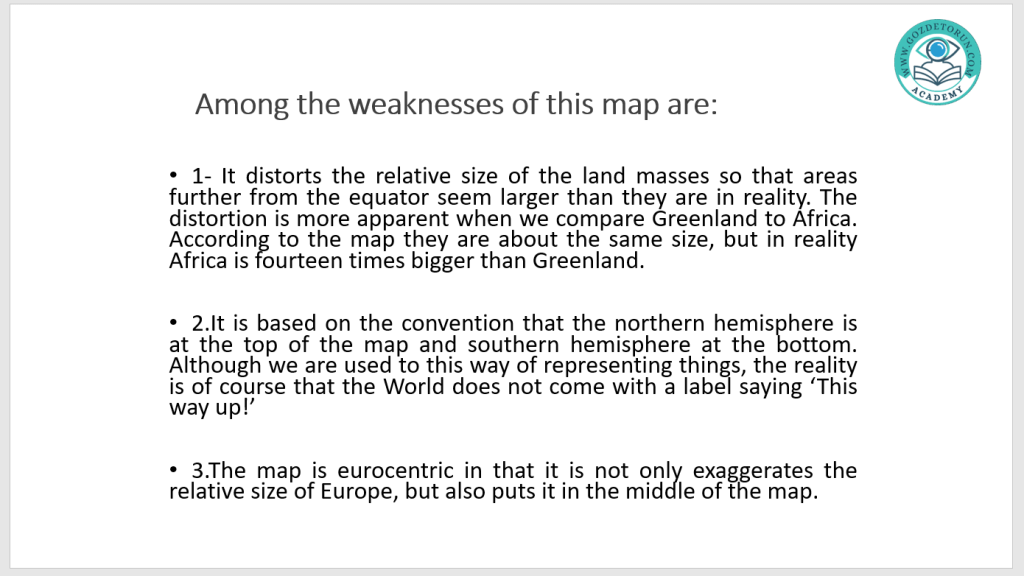
called the Mercator Proj ection and is what happens when you take a spherical globe and try
to translate it onto a flat page – this results in a stretching effect where the land masses get
distorted to fill in the spaces furthest from the equator; the relative area of the far north and
south land masses become disproportionally large compared to the land masses at the equator.
If you are not using the map to think about the relative land mass, then this poses no problem.
But not being aware of this distortion might lead you into certain false conclusions. You
might, for instance, uncritically accept that Greenland is about the same size as the continent
of Africa. However, in terms of land mass, Africa is about 14 times the size of Greenland.
While overemphasizing the size of Greenland, the flip side of this is that the size of Africa is
underemphasized. Africa is an impressively large land mass. The entirety of the USA, China,
most of Europe and India could fit within the area of Africa, yet much of the world treats Africa
and its huge countries, people, traditions, cultures and practices as if it were a homogenous
whole. It’s not unreasonable to think this might be because many maps underestimate its size
(The Economist). You can use the QR code to read the article in The Economist.
Map 2 is a response to this dilemma. This proj ection, called the Galls-Peters proj ection, is
an attempt to capture the same information as Map 1 (where the land masses are in relation
to one another, and what they look like) but with the added information of how big the land
masses are. However, it’s easy to see how the choice to capture this added fact of relative
land size has created its own distortions; the details of the land masses at the north and
south extremes become nearly impossible to read. So, the choice to prioritize one set of facts
has distorted another set of facts.
Another consequence of the choices made in building these maps is to consider what we think
of as important or valuable. The presentation of the world in Maps 1 and 2 is traditional in
Europe, while students growing up in the United States might recognize Map 4 and students
from the Pacific Island nations might recognize Map 5. In other words, the decision to place one
part of the world at the centre of the map suggests that the map values certain areas over others.
This might simply be because the map is intended for one audience and not another. Looking
at Map 3 however, it might be j arring because it makes it something of a challenge to find your
own country. There’s nothing bad at work here, but it does lead to some interesting conclusions about how these values get written into the values we hold today. ‘The Middle East’ and the ‘Far East’, for instance, are phrases that make sense if we consider ourselves to be starting from Europe. Calling the areas around the Arabian Peninsula the ‘Middle East’ suggests that they have an identity in relation to Europe, but why should that be the case? Similarly, with the Far East. We might ask ‘far from what?’ Why should the peoples and countries at the eastern edge of the Asian continent be far from anywhere? Again, this suggests that Europe is at the centre of it all, but why should this be the case? By looking at Maps 1 and 2 you might uncritically think that Europe really does sit at the top and centre of the world. The east Asian countries are pushed off to the edges. Australia ends up ‘down under’ the globe, but it’s not under anything or down from anything unless you accept that the northern hemisphere should be at the top. Considering the choices of Maps 3, 4 and 5 is more interesting. The top or the centre of these maps lead their readers into thinking about what is important.
Many maps use latitude and longitude to divide the world up and help make navigating easier,
and here again we might find hidden assumptions about what is important coded into how we
describe the world. The starting point for longitude is the ‘Prime Meridian’ and this runs through a place called Greenwich in southeast London in the United Kingdom. That this starting point runs through the UK is not an accident. At the time this feature of maps was being developed, Britain was home to the best maritime knowledge. It was also the greatest military and colonial power. The strength and knowledge of Britain at the time gave it the ability to decide that the foundations of the system used to measure the world begin in Britain. This starting point then has been coded into every navigational map on the planet today. The Prime Meridian could have been anywhere, except for the particular strengths of a little country on a little island off the coast of the European continent.
Map 6 is called an ‘Azimuthal Equidistant Projection’ which shows the relative distances from
one point on the Earth. Map 6 has chosen the North Pole as this point, but it could have
been any other point on the surface of the globe. Interestingly, this projection seems to be the
favourite with the Flat Earth Society and serves as the model for the UN logo. The knowledge
expressed in this map is different in significant ways from the knowledge expressed in the
other maps. Understanding what is being represented in each of these maps is important so you don’t mistake what you think is being represented with what is actually being represented.
Another feature of how maps might distort our understanding of the world is illustrated by the
old saying ‘the shortest distance between two points is a straight line’. When looking at any
of the maps, were we to try to calculate how to cover a great distance in the most direct way
possible we might apply that basic truth of geometry and simply draw a straight line. Applying
this principle to a sphere, however, will not result in the shortest distance.


https://create.kahoot.it/share/levels-of-knowledge/0580d547-3dc3-4805-b771-f4e75a280bdf
